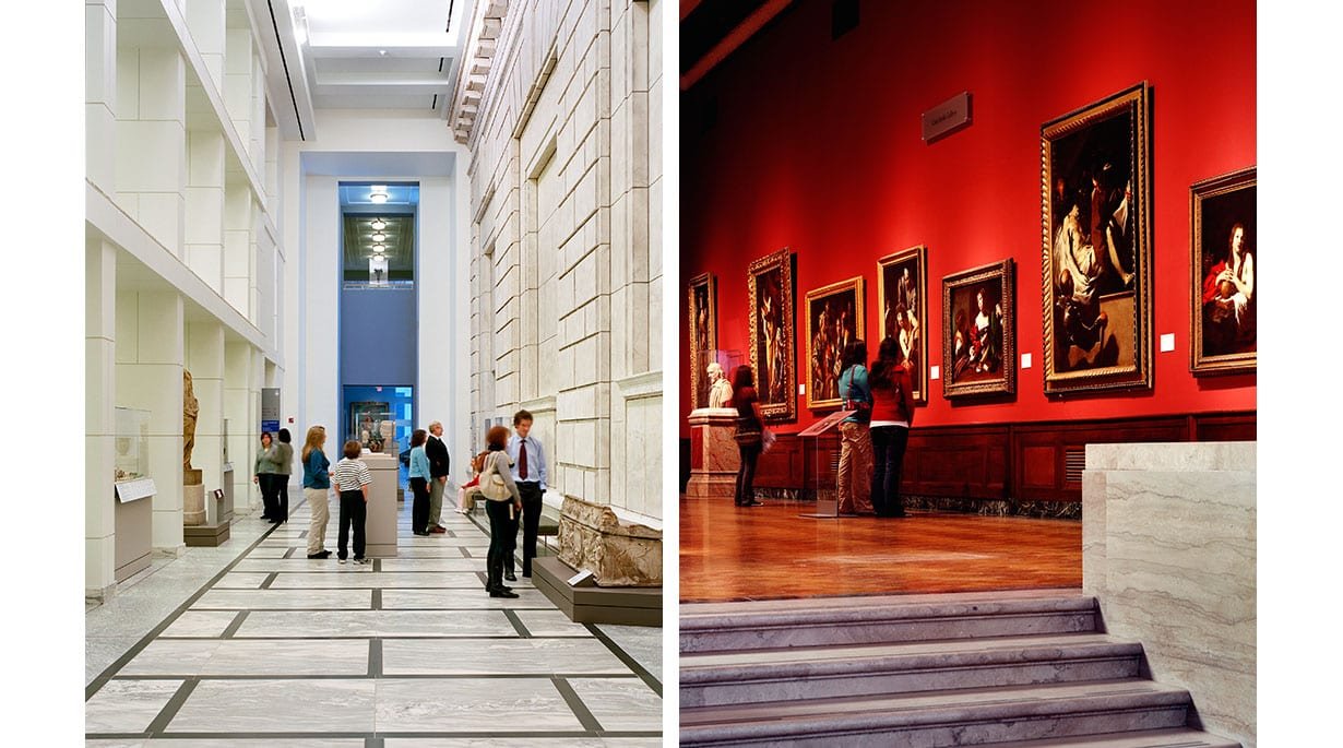
OVERVIEW
The DIA is the largest museum in Michigan & ranks yearly within the top 6 best museums in the US.
PROBLEM
With such high regard the museum needs an app to make the experience more accessible to the public. An interactive guide that lets the visitor fully immerse themselves in the museum.
SOLUTION
DIA the app requires a design for an iOS mobile app, along with clearly defined branding that can be presented in a prototype that effectively shows the key features users need from an interactive museum guide.


Assumptions
Visitors would like to have the information on hand and easily search-able while visiting the DIA.
Having an app can make ordering tickets easier- no line to wait in, can be done ahead/last minute.
People like following a guide as well as looking up specific info about the art they are viewing at the moment.
If there were a game element it would be a great way to interact with the art as well as a family activity.
Goals
Identify demographic of museum visitors
Identify what are the most useful elements on the website
Research visitors' experience at the museums.
What are the visitors needs-vs-nice to haves?
Research other museums in the area and outside the state. What do they offer that DIA doesn’t? What are the challenges they face?

I conducted the majority of my interviews over 2 weeks here in the Diego Rivera Courtyard.
Interviews
The primary research stage consisted of 1:1 user interviews. The main goal was to understand patrons’ current experience at the museum & what they would find useful as an app user.
Number of Participants: 23 Gender breakdown: 10 male / 13 female Age: 10- 65

Personas
COMpetitor Analysis
I also examined official museum apps, comparing their strengths & weaknesses, to understand how DIA might distinguish itself from the rest of the market. I found several key elements focused on human interaction and experiential design.

Key Path Scenarios
I identified two key path scenarios when using the DIA app. I chose two important features of the app: the interactive map & an audio guide. The scope of the product allowed me to focus more on these two pathways as there aren't any notable validation scenarios other than entering a familiar settings screen.

User Flow
With the project goals & the patrons needs in mind, I created a user flow diagram, identifying the key screens & interactions she would need in order to listen to the audio guide or find the quickest way to the gallery she is interested in. By mapping these pathways out, I was able to define required screens & develop a logical flow.


Branding
I built a style guide created a style guide as a means for understanding the existing DIA branding. Since it is already in use it was helpful in determining the direction for the typography styles, color palette & imagery. This step prepared me for applying the DIA’s distinct visual design to the new features, which helps when integrating features seamlessly and work mirroring website materials.

Wireframes
I started the design stage by sketching out ideas for layouts, including the features defined in the product roadmap, & referencing the task flows, user flow, & sitemap. These low-fidelity wireframes were a quick & efficient method for developing visual hierarchy & planning out key screens required to for a user as a guide or to find out more information about the artist.
First Draft:
examples of screens used in first round of prototype testing.

After receiving feedback generally positive feedback I reworked the app to provide more features. Pushing the DIA branding to give the app a more updated look.
Second Draft:

I implemented the new features in high-fidelity wireframes, making sure to adhere to the design direction outlined in the style guide. These wireframes were then used to build a prototype to be used for usability testing.


DIA: the app as a concept is something that I feel the museum would greatly benefit from. The primary difficulty I had while designing this product was staying within the confines of the current DIA style guide while updating the format for a fresh look. Also an app that included the majority of the websites features but with new app specific elements , like an audio guide.
If this app were to come to fruition I would like to expand the features or create a 2nd app to include an interactive scavenger hunt for children and young teens to have fun with the art while expanding their knowledge.